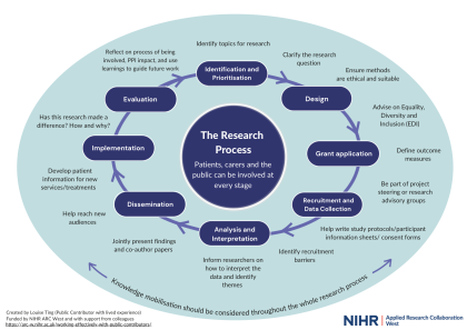
My PPI diagram a year on and 51k views later…
5 September 2024
Louise Ting is a long-term public contributor at ARC West. She’s also the brains behind the wildly successful diagram outlining how patient and public involvement (PPI) can be woven into every stage of the research cycle. In this blog she describes how the diagram has taken on a life of its own, and where her inspiration for it originally came from.
Sometimes you can have a burst of inspiration and before you know it, your random idea has turned into something so much bigger… With a life of its own, reaching people out there you never expected. This is exactly what happened with my PPI and the research cycle diagram. And that’s the other thing – yes, I conceived it and put an enormous amount of work into crafting it, refining it (the final version was the ninth version!) as well as sharing it, but it was also a collaboration. What started as something I made “just for fun” on my own at home one night became a labour of love that colleagues and members of the public in the PPI space helped to develop and promote.
51k views on X (formerly known as Twitter) despite my account only having 70 followers at the time, tens of institutions (teaching and research) around the world now using it to enhance their work, permanent poster display at the University of Cambridge, and numerous research events where it’s actively shared…
But why did I make it to begin with?
I’ve volunteered for over 15 charities and not-for-profits now and found myself helping with PPI in research about a decade ago. The two have a lot of similarities for me and throughout this time, one of the things I’ve always reflected deeply on is how to support people, include them, listen to them, and enable them to make a difference. Health and social care are particularly important to me as an area because it’s where a lot of my experience lies, due to living with chronic illness and navigating being neurodivergent in a world that isn’t set up for those differences.
I’m therefore all too familiar with being sidelined or outright excluded because of my minority characteristics. However, this diagram was intended to be accessible and to highlight that the public voice matters. If we don’t have equality, diversity and inclusion in developing and undertaking research (including its outputs), we’ll continue to overlook and underserve so many groups.
The diagram was a way of visually communicating that people and communities can be involved at every single stage of the research cycle, and demonstrating what that can look like on a practical level. Sometimes, researchers want to meaningfully involve people but just aren’t sure how to go about this. This diagram acts as a clear and concise tool to guide them and it shows public contributors where they fit in too.
I thought that after it went viral and the initial period of activity where I was invited to lots of events to present it, it’d still be useful but fade away. After all, so many things are constantly vying for our attention in this digital era and we quickly move on to the next new interesting thing… But I was surprised to be proven wrong!
So far this summer, I’ve heard from lots of people about how it continues to be used in all sorts of ways. From being included in someone’s PhD thesis (she even posted me a copy, all the way from Sweden!) to showcased on several universities’ research webpages, to presented at NIHR doctoral summer camp and more. It’s informing conversations and hopefully a reminder of how research can be made more relevant and impactful. We’re now developing a young person’s version with ARC West’s Young People’s Advisory Group (YPAG) too, so younger members can better understand how research works and why their voices matter.
I’m excited to see where the diagram goes next… It’s likely to be published in a major journal over the coming months and in an academic textbook next year, which would be amazing.
Regardless, I’m grateful to everyone that has supported me with it, whether that was through practical things like commenting on its design or simply taking the time to tell me they’ve seen or shared it somewhere! It really made me feel part of the research world, and genuinely welcomed. Just like what I wish for all the members of the public, patients, parents and carers who are referred to in the diagram.
